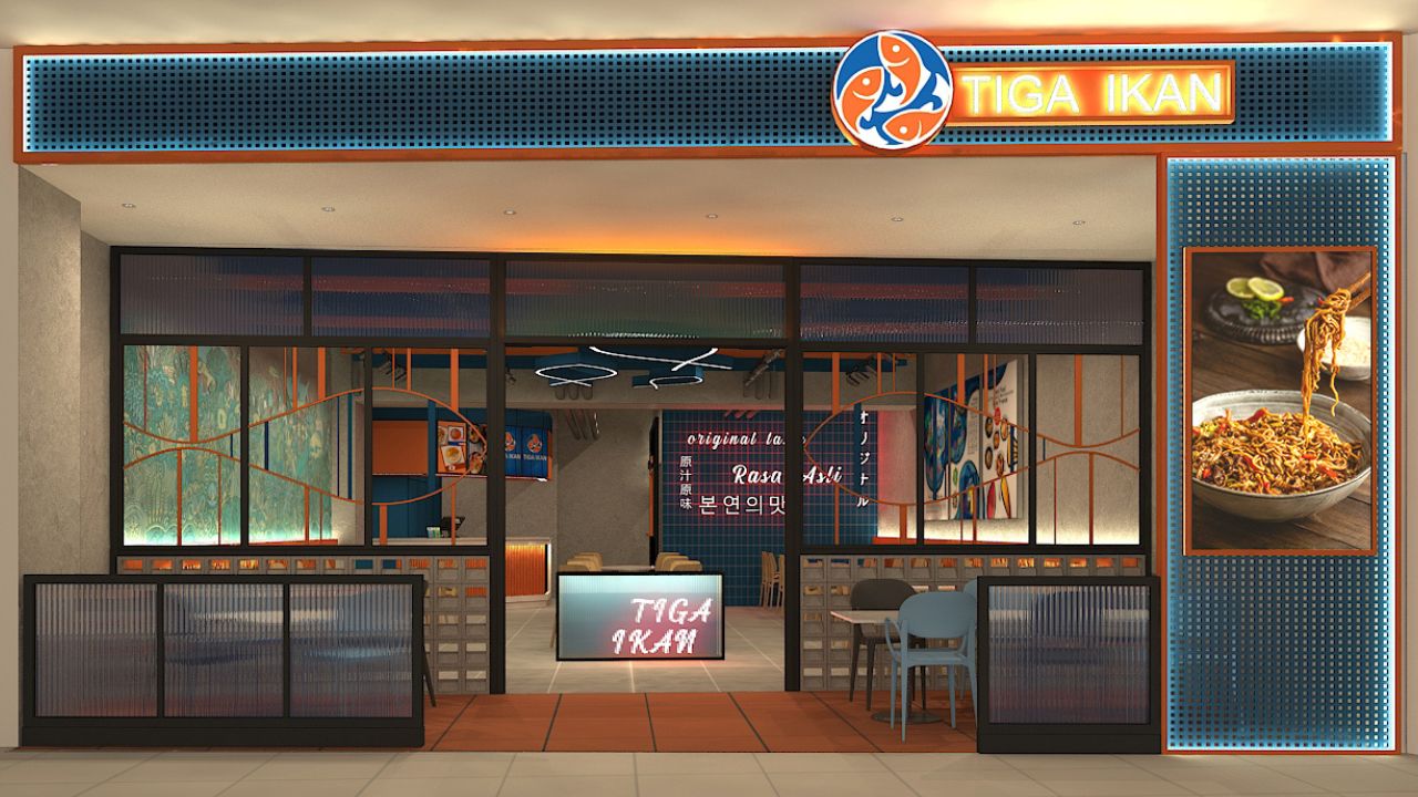
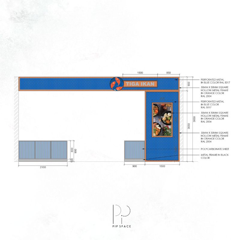
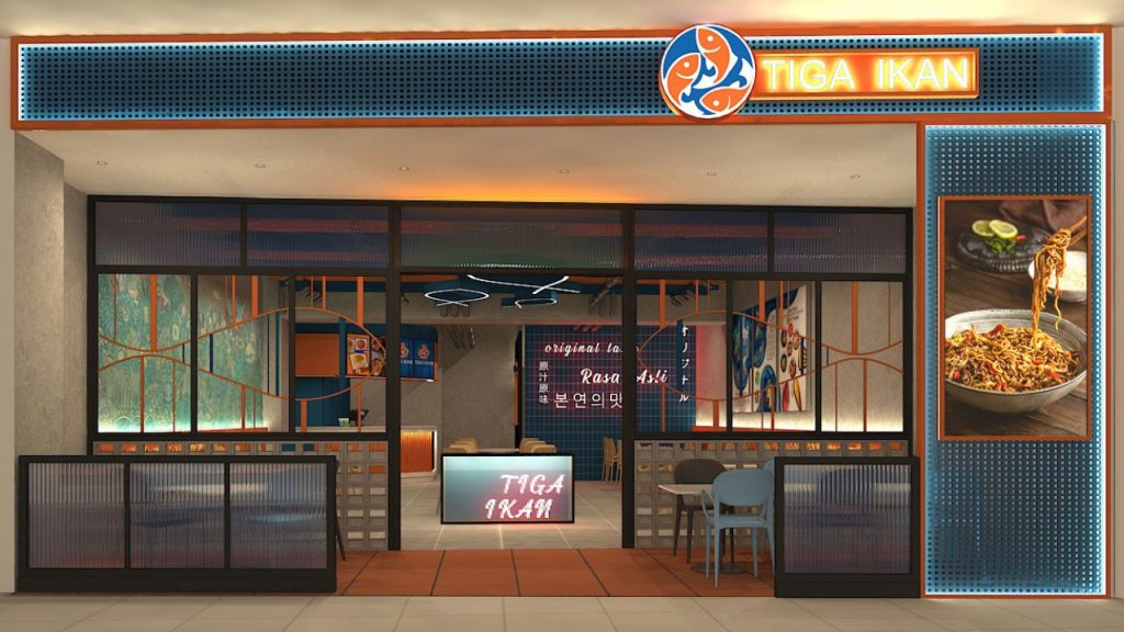
The dominant colours of the interior for Tiga Ikan is orange and blue which compliments each other.
Orange panels provides a modern touch to the environment that creates an entertaining, fun and socialising atmosphere while dining at the restaurant.
The blue tiles used for the wall to signify freshness for the main ingredient in the menu, fish.
The Foyer
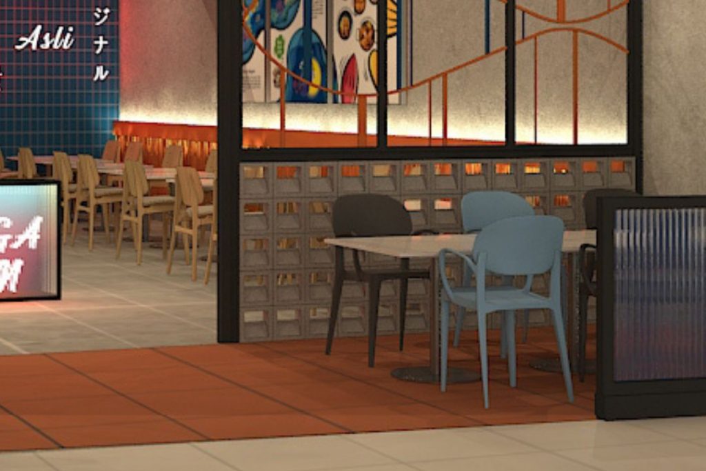
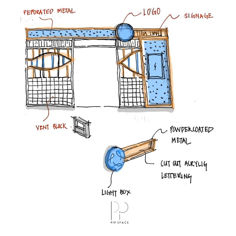
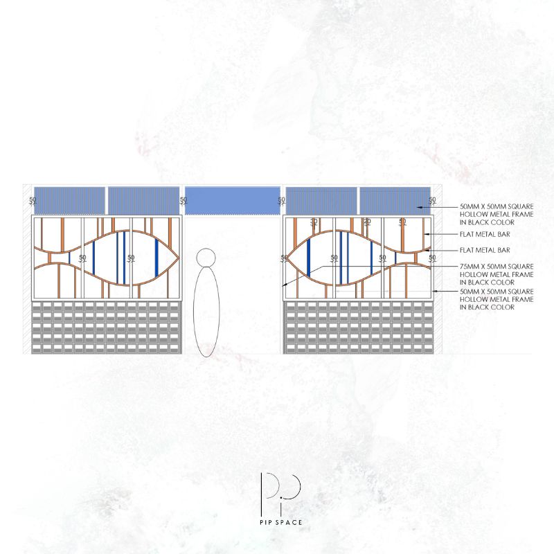
Vent blocks are used as a feature wall to separate the ‘indoor’ and ‘outdoor’ of the restaurant. The use of vent blocks adds some uniqueness to the usual divider in a restaurant by creating a refreshing look. Furthermore, the holes on the blocks gives the restaurant a feeling of spaciousness.
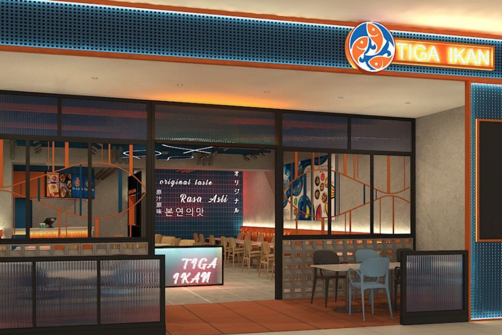
The “foyer” at Tiga Ikan uses terracotta tiles to differentiate the spaces. The “foyer” also uses outdoor chairs to uplift the overall interior of the restaurant.
Japan in Your Area
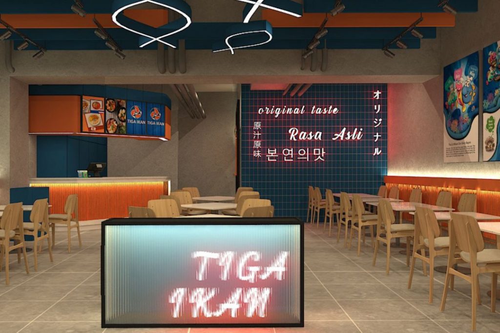
Bringing the Japanese street closer to you. The exuding and inviting ambience with bright pink neon lights looks similar to a busy late night Japanese street.
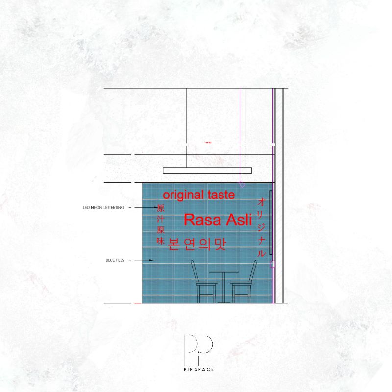
The special blue tile walls with neon lights of different language is the place you will want to be! With the snappy wordage and funky design, this special wall at Tiga Ikan expresses the different countries’ fish dishes that will be incorporated into their menu.
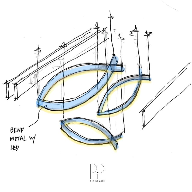
- Design Sketches -
by Chelsey
Colour Tone
The dominant colours of the interior for Tiga Ikan is orange and blue which compliments each other.
Orange panels provides a modern touch to the environment that creates an entertaining, fun and socialising atmosphere while dining at the restaurant.
The blue tiles used for the wall to signify freshness for the main ingredient in the menu, fish.
The Foyer
Vent blocks are used as a feature wall to separate the ‘indoor’ and ‘outdoor’ of the restaurant. The use of vent blocks adds some uniqueness to the usual divider in a restaurant by creating a refreshing look. Furthermore, the holes on the blocks gives the restaurant a feeling of spaciousness.
The “foyer” at Tiga Ikan uses terracotta tiles to differentiate the spaces. The “foyer” also uses outdoor chairs to uplift the overall interior of the restaurant.
Japan in Your Area
Bringing the Japanese street closer to you. The exuding and inviting ambience with bright pink neon lights looks similar to a busy late night Japanese street.
The special blue tile walls with neon lights of different language is the place you will want to be! With the snappy wordage and funky design, this special wall at Tiga Ikan expresses the different countries’ fish dishes that will be incorporated into their menu.